 Excerpt
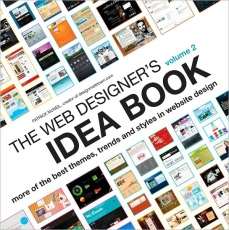
from The Web Designer's Idea Book, Volume 2: More of the Best Themes, Trends and Styles in Website Design
by Patrick McNeil
Blog
By Patrick McNeil,
Author of The Web Designer's
Idea Book, Volume II: More of the Best Themes, Trends and Styles in
Website Design
Blogging is a vital element in the next generation of the Internet. Inherently, blogging builds on a community of readers. As with any web site, you have a small window of time to capture the attention of the user. What follows are a few key considerations when designing a blog to ensure the blog's message is effectively delivered.
Add Images to Get Posts Read
Blog strategists talk about the creation of short, catchy blog post titles. While this is an effective tip for increasing consumption of your content, another thing you can do to grab a user's eyes is add images or graphics to all your posts. Each graphic needs to be exciting, dramatic and related to the content of the post. "Inspired Mag" creates custom graphics for every one of their posts. "Design Shard" uses screenshots to show the effectiveness of their tutorials. "The Statement" incorporates several graphics of photos, effectively creating a gallery of related images for each post.
Make Feature Articles Stand Out
Whether it is with a simple border, a change in color, or graphic element, you can draw a user's eyes to a specific section of a site. There, you should feature your more recent or most popular articles. "idsgn" uses an increase in image size and placement to push their most recent article. "Upsidestudio" shows only their more recent blog post on the homepage. "Snook" simply separates the featured articles from the rest with bolded and enlarged text and a small change in placement.
Make It East, Make it Fast
Whether you're designing a "mommy blog" or a corporate news blog, the end game is the same; a thriving blog needs users subscribing, commenting and sharing. Make it easy on the user - - help him reach a goal by using obvious and traditional placements and graphics and links.
Subscribing: The RSS icon has become a staple in blog design and should always have a place at the top, center, and bottom of every blog. A simple click of the icon should bring up a feed or a feed page that features several ways for a user to subscribe. "Upsidestudio," for example, has several conveniently placed RSS icons throughout their design.
Commenting: Every post should have a link leading directly to the comment submission form. Entice the user by showing the comment count or stating "Be the first to comment." Readers want to either join in on a conversation taking place or be the first to share their opinions.
Sharing: Along with comment links, every post should have a simple way to share its URL on social networks. Typically, the logo of the social network is used as a link and once clicked, a user will be brought to that site with content related to the post already filled out and ready to share.
The above is an excerpt from the book The Web Designer's Idea Book, Volume II: More of the Best Themes, Trends and Styles in Website Design by Patrick McNeil. The above excerpt is a digitally scanned reproduction of text from print. Although this excerpt has been proofread, occasional errors may appear due to the scanning process. Please refer to the finished book for accuracy.
Copyright © 2010 Patrick McNeil,
author
of The
Web Designer's Idea Book, Volume II: More of the Best Themes, Trends
and Styles in Website Design
